

The 1966 Batman logo - as unique as it's series
Moderators: Scott Sebring, Ben Bentley
-
Lee Kirkham

- Posts: 2
- Joined: Tue Aug 21, 2012 11:45 am
The 1966 Batman logo - as unique as it's series
If you look at the TV series logo, it becomes apparent that it was a product of the hand-drawn age of artwork, with it's myriad inconsistencies and flaws, which is what makes it great! That unique craftsmanship and style. It's instantly identifiable among any other Bat logo produced.

I find you to be odious, abhorrent and insegrevious.

Re: The 1966 Batman logo - as unique as it's series
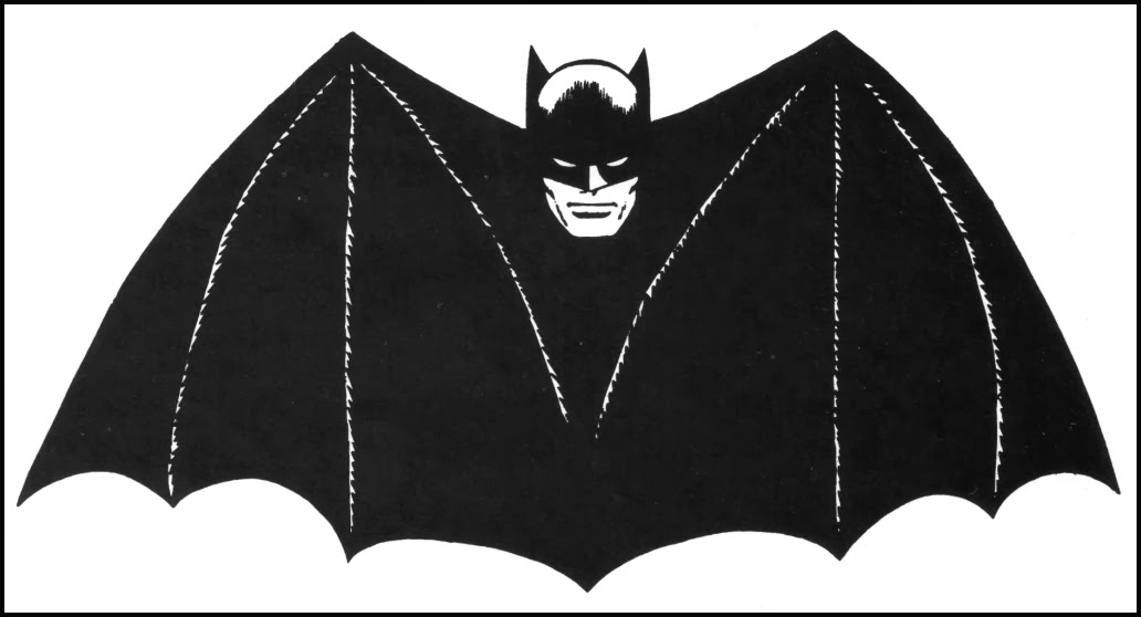
My favorite, too and here's the other one that I always identify with. It's the one used on a lot of the merchandise from the era.
- Attachments
-
- Bat Logo 1960s.png (85.63 KiB) Viewed 9091 times

Re: The 1966 Batman logo - as unique as it's series
The cool lettering was created for the TV logo, but the underlying image -- bat wings and Batman head -- dates back to the 40s. I was stunned when I first saw this, because the logo looks so "modern" to my eyes.
Bonus: Here's a cool video I found that re-traces the evolution of the bat-logo.
Bonus: Here's a cool video I found that re-traces the evolution of the bat-logo.
-
robinboyblunderer
- Posts: 4
- Joined: Fri Apr 12, 2013 2:15 pm
Re: The 1966 Batman logo - as unique as it's series
The 66 logo is great and fits the opening animation perfectly. I particularly like the bat-ears on the letter A's.
-
BATWINGED HORNET

- Posts: 0
- Joined: Fri Sep 07, 2012 5:32 am
Re: The 1966 Batman logo - as unique as it's series
I love the TV logo; it was the stylish bridge between the 1940s logo (as seen in Quillpen's post) and the wild, off-the-cuff styling in the 60s. In the book Batman: Cover to Cover, the late 60s comic logo (starting in issue 220) it is suggested the type fitting inside the bat shape could have been inspired by the TV series logo. I agree, as i've always believed the logo to be the "next generation" of the 1966 version, whether planned or not.
Perhaps the idea that anything along the lines of the 1966 logo was "kid friendly" also inspired this "next generation" logo to be used for the Mego 8-inch action figure (1972) and the 1st season title sequence of the Super Friends (1973).

Perhaps the idea that anything along the lines of the 1966 logo was "kid friendly" also inspired this "next generation" logo to be used for the Mego 8-inch action figure (1972) and the 1st season title sequence of the Super Friends (1973).
Beneath Wayne Manor
Re: The 1966 Batman logo - as unique as it's series
Can you imagine if DC wasn't so canon-istic (for lack of a better word) back then? Instead of just Batman and "Tec, we could have had a separate TV series comic book with the TV series logo & Adam West characters instead of having to wait all these years. If they had, it probably would have out-sold BM & Tec and probably would have sunk at least one of those titles.

Re: The 1966 Batman logo - as unique as it's series
Notice that although the bat-shape did originate in the comics, the head as well as the lettering was redone for the show. And as Lee noted, it's a bit "off," which adds to the charm.
My favorite as a kid was that 1970 version, designed by Neal Adams. However I understand it proved very limiting when it came to comic cover designs, and they dropped it relatively quickly (even though it still appeared in the interiors of Worlds Finest and Justice League for a long time thereafter).
My favorite as a kid was that 1970 version, designed by Neal Adams. However I understand it proved very limiting when it came to comic cover designs, and they dropped it relatively quickly (even though it still appeared in the interiors of Worlds Finest and Justice League for a long time thereafter).
"You were right again, Batman. We might have been killed."
"Or worse. Let's go..."
"Or worse. Let's go..."
Re: The 1966 Batman logo - as unique as it's series
The TV show Bat has (what I've always thought to be) a subtle smile, perhaps to add to kid-appeal.SprangFan wrote:Notice that although the bat-shape did originate in the comics, the head as well as the lettering was redone for the show. And as Lee noted, it's a bit "off," which adds to the charm.
My favorite as a kid was that 1970 version, designed by Neal Adams. However I understand it proved very limiting when it came to comic cover designs, and they dropped it relatively quickly (even though it still appeared in the interiors of Worlds Finest and Justice League for a long time thereafter).

Re: The 1966 Batman logo - as unique as it's series
I always liked how the 1943 serial logo reminded me of the TV show's logo. 

-
Chuck Williams

- Posts: 0
- Joined: Thu Aug 30, 2012 7:57 am
Re: The 1966 Batman logo - as unique as it's series
Love the TV show logo!!
Here are a couple of versions of a piece I did of the old Bob Kane styled Batman in the same theme...
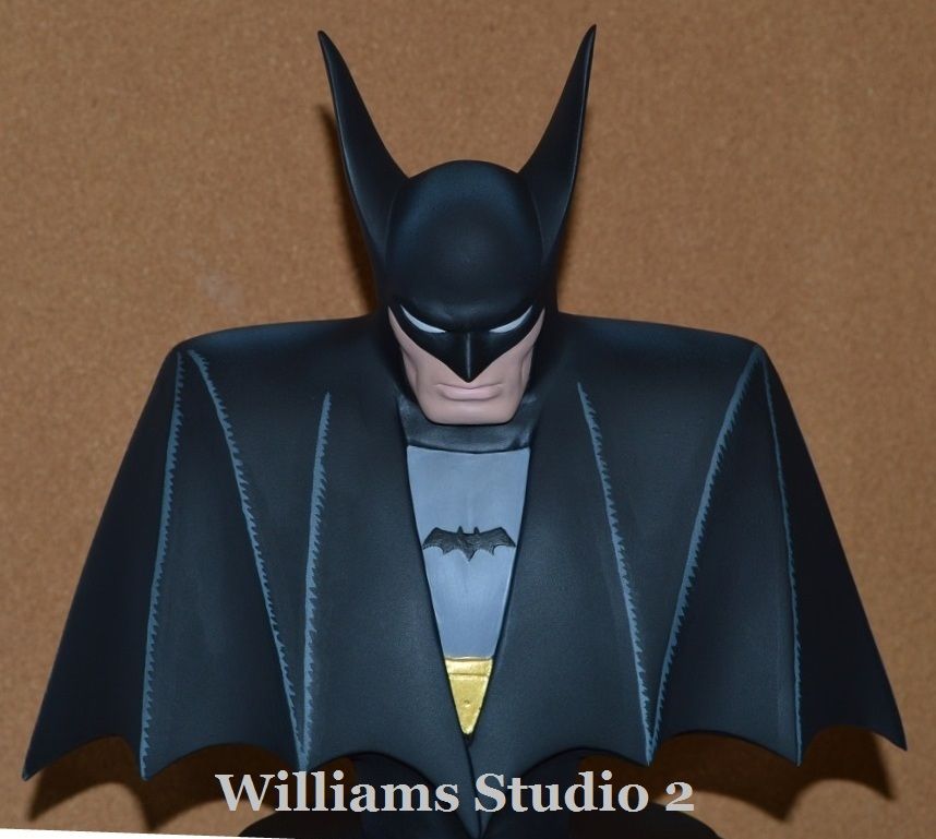
Same sculpture, different paint...
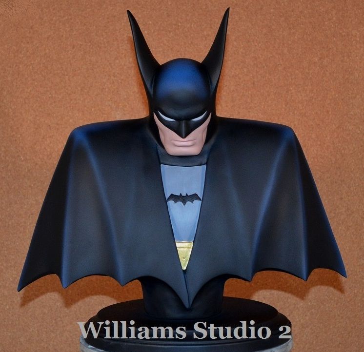
Here are a couple of versions of a piece I did of the old Bob Kane styled Batman in the same theme...
Same sculpture, different paint...
Quick, Everyone, Flee for your lives, into the street!!!!
http://www.etsy.com/shop/WilliamsStudio ... eller_info
http://www.etsy.com/shop/WilliamsStudio ... eller_info
-
Dark Detective
- Posts: 0
- Joined: Sun Sep 09, 2012 2:20 pm
Re: The 1966 Batman logo - as unique as it's series
Gernot wrote:I always liked how the 1943 serial logo reminded me of the TV show's logo.
My favourite serial. It's been years since I last watched it.
John
-
Dark Detective
- Posts: 0
- Joined: Sun Sep 09, 2012 2:20 pm
Re: The 1966 Batman logo - as unique as it's series
Very nice, from 'tec #31.Chuck Williams wrote:Love the TV show logo!!
Here are a couple of versions of a piece I did of the old Bob Kane styled Batman in the same theme...
Same sculpture, different paint...
John
Re: The 1966 Batman logo - as unique as it's series
I just saw it a few months ago!Dark Detective wrote:Gernot wrote:I always liked how the 1943 serial logo reminded me of the TV show's logo.
My favourite serial. It's been years since I last watched it.
John
-
BATWINGED HORNET
- Posts: 0
- Joined: Fri Sep 07, 2012 5:32 am
Re: The 1966 Batman logo - as unique as it's series
Chuck Williams wrote:Love the TV show logo!!
Here are a couple of versions of a piece I did of the old Bob Kane styled Batman in the same theme...
Same sculpture, different paint...
such sharp work, Chuck. Have you ever considered sculpting the entire logo--with the name? Or any of the other Bat-logos?
Beneath Wayne Manor
-
Chuck Williams
- Posts: 0
- Joined: Thu Aug 30, 2012 7:57 am
Re: The 1966 Batman logo - as unique as it's series
Thanks!
Nope, logos are best done with printing plates (the way we did them a million years ago!) or on computer now.
Faster and more accurate that way too.
Making a hybrid, high relief sculpture sounds intriguing though!
Chuck...
Nope, logos are best done with printing plates (the way we did them a million years ago!) or on computer now.
Faster and more accurate that way too.
Making a hybrid, high relief sculpture sounds intriguing though!
Chuck...
Quick, Everyone, Flee for your lives, into the street!!!!
http://www.etsy.com/shop/WilliamsStudio ... eller_info
http://www.etsy.com/shop/WilliamsStudio ... eller_info