

Hey, Batfolks:
Here's something that I think fans here will dig over at 13th Dimension -- and yes, BATMAN '66 factors into it:
https://13thdimension.com/the-13-greate ... os-ranked/
Check it out if you like!
-- Dan
The 13 Greatest BATMAN Logos — RANKED
Moderators: Scott Sebring, Ben Bentley

Re: The 13 Greatest BATMAN Logos — RANKED
Thanks for sharing this. I'd never seen Todd Klein's blog, either. He states that "DC staffer Joe Letterese" proclaimed to be the artist behind the Bat-Fight typography. Is there any documentation or word-of-mouth as to which person or agency worked on the '66 series logo or animated/illustrated the opening sequence?

Re: The 13 Greatest BATMAN Logos — RANKED
There are a number of entries I'd have skipped, just because I tend not to like anything after the 80s, but I generally agree with the sequence (I'm very fond of #6, but I can see where it would've been a pain for cover artists, given how much space it takes up).
However, you made a glaring omission in leaving out the Animated Series logo, which was awesome:
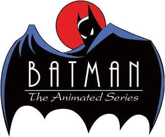
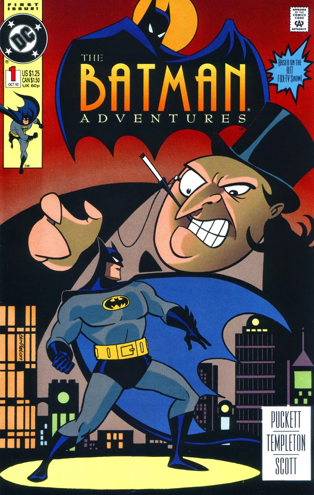
...even if the "caligraphy" in the sub-title seemed an odd choice. But that was corrected with the tie-in comics:
However, you made a glaring omission in leaving out the Animated Series logo, which was awesome:
...even if the "caligraphy" in the sub-title seemed an odd choice. But that was corrected with the tie-in comics:
"You were right again, Batman. We might have been killed."
"Or worse."
"Or worse."

Re: The 13 Greatest BATMAN Logos — RANKED
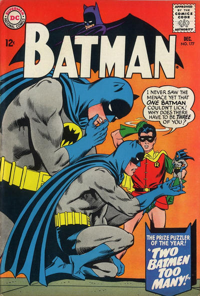 For me its the 65 to 69 version. Always wanted that one on a T shirt
Some days you just can't get rid of a ... SHARK!